List Headline Image
Updated by Learning Resources Network on Jul 16, 2016
 REPORT
10 items   1 followers   0 votes   274 views

Top Community Education Websites

LERN’s picks for the top community education websites and what makes them standout.

In no particular ranking, they are:

Community Programs - Red Deer Public Schools
  • Very clean.
  • It has a nice, large, compelling slide show.
  • The menu is really innovative. Very different than the common dropdown menu and still provides a very clean, easy to navigate appearance.
  • Very nice news and events page
  • Fills the whole browser page
The Lifelong Learning Center - Missoula County Public Schools
  • It has a simple, clean, easy-to-navigate look.
  • Have the upcoming events down the right side is a good feature
  • We like the way the slideshow blends in and out.
Parkway-Rockwood Community Ed - Home
  • We like this page because it is simple and not too crowded. Having a clean, white background works well for this site.
  • The offset sideshow is a new, interesting look.
  • Excellent drop-down menu, it even has “two-tier” under several of them
  • We like the small pictures and the way the latest news section is laid out.
  • Nice logo
Burnaby Community & Continuing Education | New Job. New friends. New language. New knowledge. New opportunities.
  • This is a clean, non-flashy, easy to use site.
  • This have a nice logo and clean heading bar
  • The dropdowns and categories on the right are easy to navigate.
  • A simple, yet well done site
Ann Arbor Public Schools Rec & Ed
  • Very nice layout. We love the lightened picture of the tree in the background. It’s tastefully done so it doesn’t compete with the slide show.
  • The slide show itself is tasteful and well done graphically.
  • We don’t like the drop-down menu below the slideshow because the menu drops down below the fold. It would work if it “dropped up” instead.
  • Overall a very visually stunning site.
Hopkins Public Schools Community Education
  • Well laid out and a great use of images
  • Good slideshow, but also great use of the small images just “above the fold”
  • Well laid out and extensive dropdown menu at the top
  • Easy to navigate and find what you’re looking for
WDMCS Community Education
  • Awesome layout and background
  • Really nice graphics
  • Great drop-down menus and the content organization system below the graphic is unique, functional and visually appealing.
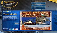
Wayzata Public Schools Community Education
  • Very clean, innovative look
  • Distinctive color scheme and fills the browser nicely
  • Good drop-down menu at the top. Easy to navigate.
  • The “Quick Links” menu in the top right is very different yet helpful and easy to use. Blends really well with the site theme.
  • Nice use of scroll boxes for Happenings and Headlines
Community Education Classes | NISD Adult & Community Education
  • It has a clean, innovative feel.
  • The menus are great and look good graphically.
  • The top half of this site is great, both functionally and graphically.
Edmonton Public Schools Metro Continuing Education
  • Very clean look
  • Fills the whole browser
  • Very extensive drop-down menus on the top of the page and a very interesting menu feature just above the fold.