 Iñaki Quenerapú
CSS frameworks are pre-prepared libraries that are meant to allow for easier, more standards-compliant styling of web pages. Grid systems are valid css / xhtml structures for rapid web prototyping, development and production environments.
Bootstrap, a sleek, intuitive, and powerful mobile first front-end framework for faster and easier web development.
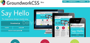
Foundation: The Most Advanced Responsive Front-end Framework from ZURB The most advanced responsive front-end framework in the world. Responsive design gets a whole lot faster for users. It's now crazy fast for designers and engineers to code and learn too. Faster for Users Users will feel the speed.
Coding and support for CSS technology in various email clients.
34Grid is a Responsive Grid System based on "equally distributed columns" layout basis. In contrast to other great grid systems (@see bottom of page), 34Grid provides equally distributed columns for each row. (and also column complements for inequal distributions) If you're already familiar with grid systems and responsive web design just create&download a bundle and see what is inside.
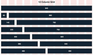
Download - CSS, sketch paper, and templates for: Acorn, Fireworks, Flash, InDesign, GIMP, Inkscape, Illustrator, OmniGraffle, Photoshop, QuarkXPress, Visio, Exp Design. Repository at GitHub. Essence The 960 Grid System is an effort to streamline web development workflow by providing commonly used dimensions, based on a width of 960 pixels.
Time is a very precious thing these days and with Amazium we've done all the basics for you so you can very quickly setup your website ready for styling using our 12 column grid.
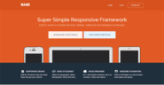
Base is a super simple, responsive boilerplate, built to work on all devices big, small and in-between.
Well, I'm releasing an amazing new grid system today. It's based on what I call the "rubber layout" system. There are 4 different layout types, and each one is optimized for different displays. There are also some starter styles. Check out the project page for more info.
The official homepage for Blueprint, the original CSS framework. Also known as Blueprint CSS.
Cardinal is a small, "mobile first" CSS framework for front-end developers who build responsive web applications. It focuses on performance, accessibility, and readability first.
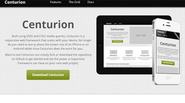
Originaly Centurion was built only a responsive grid, so at its core Centurion is built to be responsive. Developed along the same lines as the 960 Grid built by Nathan Smith. The grid is built using a Sass mixin, which makes it highly customizable.
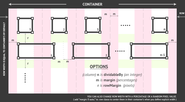
Columnal CSS Classes .container (In common with cssgrid.net) The container is the full page width and allows a background behind column content. It is the highest element of the grid system and contains the other main elements, .row and columns.
cSans is a light, flexible and expandable css framework. It is compatible with modern browsers (ie5, ie6, ie7, firefox, safari, opera...) & platforms, and its api is very intuitive and comfortable.
CSS Library for easy and fast development of responsive and mobile websites.
Fluid Baseline Grid is a web development kit created by Josh Hopkins and 40 Horse, LLC. It's made for rapid prototyping website layout design with CSS3 and HTML5.
Four features Columns, gutters, a baseline and a script. Folding columns Golden Grid System (GGS) splits the screen into 18 even columns. The leftmost and rightmost columns are used as the outer margins of the grid, which leaves 16 columns for use in design.
The Goldilocks Approach to Responsive Web Design - A good starting point for design that takes device resolution out of the equation
Gridiculous was created after I tried out a bunch of different responsive grids and realized that none of them offered all of the features I required. First and foremost, I wanted to make sure that the grid would work from a large desktop monitor through to a tablet and all the way down to a mobile phone.
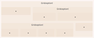
Each .grid element is a horizontal row which can contain.unit elements of various widths. Width combinations are illustrated below.
Gridless is an optionated HTML5 and CSS3 boilerplate for making mobile first responsive, cross-browser websites with beautiful typography.
Usage Syntax Gridlock features three distinct grid sizes that correspond to specific screen sizes: desktop, tablet and mobile. Desktop features a full 12 or 16 column grid, tablet snaps down to 6 or 8, and mobile contains only 3. The syntax is simple and easily read: [target device]-[column count].
Github Project - Version 2.5.0 Created & Maintained by Gary Hepting
Create rapid and logical page layout and app prototypes with Gumby Framework, a flexible, responsive CSS framework, powered by Sass
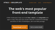
HTML5 Boilerplate is a professional front-end template for building fast, robust, and adaptable web apps or sites. Spend more time developing and less time reinventing the wheel.


