Priyanka Shah
When building React applications, using a UI component library can save development time and ensure a consistent design system. Here are some of the best UI component libraries for React, each with its own strengths and use cases:
Source: https://www.dhiwise.com/post/choosing-the-right-react-ui-component-library-for-your-project
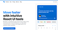
Material-UI (MUI) is one of the most popular React UI libraries, implementing Google’s Material Design principles. It offers a comprehensive set of pre-designed components, theming capabilities, and strong community support. Ideal for projects that require a sleek and modern look.
🔹 Pros: Highly customizable, large ecosystem, strong documentation
🔹 Best for: General-purpose web apps, dashboards, and enterprise applications
Chakra UI is a simple, modular, and accessible UI component library for React. It focuses on flexibility and ease of use, providing built-in theming support and great accessibility out of the box.
🔹 Pros: Highly composable, dark mode support, accessibility-first
🔹 Best for: Modern web apps, SaaS applications, and quick prototyping
Ant Design (AntD) is a UI framework developed for enterprise applications. It provides a set of high-quality, polished components that follow a consistent design language. It’s widely used in business applications that need a professional and structured UI.
🔹Pros: Feature-rich, strong design consistency, robust data components
🔹Best for: Enterprise dashboards, B2B applications, and admin panels
Semantic UI React is the official React integration for Semantic UI, a framework that provides clean, human-readable HTML with an intuitive class-based styling system.
🔹 Pros: Simple syntax, extensive pre-styled components, good accessibility
🔹 Best for: Fast prototyping, projects requiring minimal custom styling
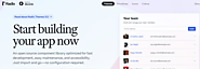
ShadCN/UI is a new, highly customizable UI library that integrates well with Tailwind CSS. Unlike traditional UI libraries, it provides components as actual code that can be customized instead of just precompiled styles.
🔹 Pros: Fully customizable, Tailwind-compatible, lightweight
🔹 Best for: Developers who want complete control over styling
Radix UI provides a set of accessible, unstyled UI components that allow developers to create custom designs while ensuring usability and accessibility. It’s great for those who need fine control over the UI without any opinionated styling.
🔹 Pros: Accessibility-focused, unstyled for flexibility, developer-friendly
🔹 Best for: Custom design systems, accessible web apps
React Bootstrap is a React-based implementation of the popular Bootstrap framework. It provides familiar Bootstrap components with native React components for better integration.
🔹 Pros: Bootstrap-compatible, responsive, easy to use
🔹 Best for: Traditional websites, legacy projects, or Bootstrap-based designs
Grommet provides a rich set of responsive and accessible UI components. It’s designed with modern web applications in mind, featuring a focus on flexible layouts and theming.
🔹 Pros: Great accessibility, responsive design, theming support
🔹 Best for:Apps needing a strong visual design with accessibility in mind
Evergreen UI is a flexible, minimal, and highly composable React UI framework developed by Segment. It emphasizes modern design with out-of-the-box theming options.
🔹 Pros: Clean design, flexible theming, good accessibility
🔹 Best for: SaaS applications, modern web apps, design-conscious projects
Headless UI, built by the creators of Tailwind CSS, offers fully unstyled, functional components that allow you to implement your own styling while maintaining great accessibility.
🔹 Pros: Fully customizable, pairs perfectly with Tailwind CSS, accessibility built-in
🔹Best for: Tailwind CSS projects, fully customized UI components