-
About
- About Listly
- Community & Support
- Howto
- Chrome Extension
- Bookmarklet
- WordPress Plugin
- Listly Premium
- Privacy
- Terms
- DMCA Copyright
- © 2010-2025 Boomy Labs

 Reuben Walker
Listly by Reuben Walker
Well planned and executed landing pages let you turn your emails, social media and even blog posts into sales. Read these 11 articles to become a master of designing and writing for conversion. They cover the psychology of design, best practices and copywriting for landing and sales pages.

You work your butt off for your clients, and they know it, but how do you convey this on the services page of your website without bragging too much or too little? It's a balancing act that you CAN only figure out by testing to see what your clients like.

What's special about the compelling content you retweet, Like, bookmark, and email to your friends? Those articles serve the audience, not the content creator. Creative work that instantly captivates and holds an audience's attention influences their lives. Transcribing the thoughts in your head won't always serve a purpose.

That's how the widely recognized UX Expert, James Chudley, in his article, " How to use photos to sell more," summarizes the way you should select high-converting images. It boils down to this: What's the purpose of the images on your website?
The first thing to understand about content strategy is that no two people understand it the same way. It's a relatively new - and extremely broad - discipline with no single definitive definition.

When someone visits your Twitter, Facebook, Pinterest, Google+ or Instagram profile what do they do next? Speaking for myself - and I'm sure I'm not alone - if someone looks remotely interesting then I'll click on the link on their profile. So far, so good, but this behavior doesn't help you with social media conversions.

Visualize this- You walk into your usual drinking hole with a few of your buddies and spot a cute girl sitting at the bar sipping a martini, swallowing your usual nervousness and awkwardness you go over to her and ask if you can sit down, to your surprise she says yes.
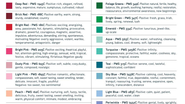
Colors, we've seen before, quickly convey emotions and affect people's moods. Whether you're choosing paint for a room or are designing a presentation, this Psychology of Color chart, which matches specific Pantone colors, can come in handy. Created by the Carey Jolliffe Graphic Arts agency, the chart covers a wide spectrum of colors (not just "green" for example, but ten shades of green/green-blue).

In the dark and ancient days of digital yellow highlighters and outrageous claims, a cry rang out over the mountains - a cry for sanity, integrity, and beauty. There came forth from the mountain 10 commandments to guide a certain tribe of Internet publishers in all their conversion endeavors.

Landing pages are remarkably powerful conversion and SEO tools that turn traffic into money. They force readers to focus on one thing - and one thing only. To boost your email newsletter or blog subscribers ... sell more of your digital or physical product ... or dominate a keyword in search rankings ...

Creating a landing page these days is really easy, especially with all of the landing page tools out there. But what's hard is creating one that actually converts well. Why? Because you have to take into account the elements on the page, where to place them, what message your design is going to portray, and how the text is going to affect each visitor.
Have you ever wondered if your landing page is ... missing something? You look at the conversion stats on your latest landing page and sigh in disgust. Yeah, some people are subscribing or buying, but you know you should be seeing better results.
We all do it ... daydream about our website finally breaking through ... getting the attention it deserves ... and actually allowing us to earn a living on our terms. Sometimes we see a glimmer of this dream coming true with a steady rise of subscribers, a flood of comments with each article, or a rush of traffic from a successful guest blog post.
