-
About
- About Listly
- Community & Support
- Howto
- Chrome Extension
- Bookmarklet
- WordPress Plugin
- Listly Premium
- Privacy
- Terms
- DMCA Copyright
- © 2010-2025 Boomy Labs

 Jeannie Walters
Listly by Jeannie Walters
Each month, we pick a great example of a microinteraction - either what to do OR what not to do. Microinteractions are the small moments that impact the customer experience.
What's a microinteraction? It's the little thing that sets the tone for an experience. We're obsessed with them around here. We think they are often overlooked and are the types of events that can make or break not only the experience of a customer with a brand, but someone's entire day.
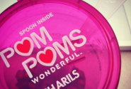
Last month, we introduced the idea of recognizing our favorite (and not so favorite) microinteractions. It's the little thing that sets the tone for an experience.

No permission?? Not impressed. Microinteractions can be ghastly too and leave the customer with a bad impression so it's helpful to pay attention!
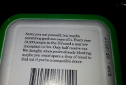
I saw this picture scroll by in my Facebook feed. Like, hold up! I zoomed in and gasped. Genius microinteraction and packaging
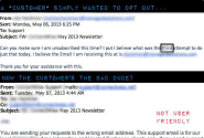
I love when we get microinteraction submissions from members of our community! It shows two things: 1. These small moments matter. Just as we preach around here, those small moments we have to interact with customers (or just fellow humans) are precious. They should enlighten, entertain or educate. Not disappoint like this one.

Finding what you need in today's world can be a real challenge but wicked good microinteractions like this can delight (and help) the customer

You don't have to send your employees on a posh escape to make them stay.
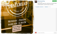
Our Microinteraction of the Month comes from Stan Phelps of 9INCH Marketing who captured a rather unfortunate microinteraction that might offend customers.
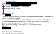
A bad customer service email is just one interaction, but these kind of things could haunt your brand.
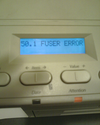
Do you know what a FUSER error is? Most don't, and it's just a pain.

Google Doodles are delightful and engaging, but imagine the surprise when they personalized it one day for a lady's birthay!!
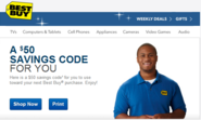
A bad customer experience might be remembered, but how you handle it proactively will make a lasting impression. Heroes are never made in absence of a crisis!
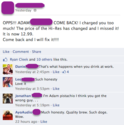
A beer store went public on Facebook when they accidentally overcharged a customer.
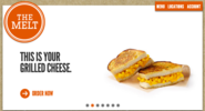
The Melt, a grilled cheese joint chain, came up with an innovative way to leverage the usually banal QR code to deliver a customer centric service!
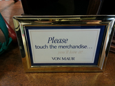
Do not touch! You break, you buy. I'm sure everyone has seen signs like this, especially in retail stores. So many times, in fact, that we no longer really need to see them. We often assume these rules apply in most places. Why do many retailers feel the customers don't need to touch anything?
Scrambling to fix that mistake? This amazing email comeback teaches us how to recover from mistakes.
The restroom at my local San Francisco Starbucks has been Out of Order for at least seven months. That's what the signs have been telling me, anyway. After the first month, I thought, "man, contractors must be expensive in the Bay Area," but then I grew suspicious.
My mother, Jane Reuss, is a Member Engagement Advisor for Life Time Fitness. When visiting her at her office recently, I was befuddled when I saw a cute pyramid of water bottles wrapped in gym towels on the counter behind her desk. I asked her, "Mom, what are those?"
This is a Public Service Announcement: Good guys don't finish last in customer service! The pressure to stay competitive is more prevalent now. Who has the "raddest and baddest" mobile site? Who came up with the most creative social media campaign or packaging design for bandages?
Email is one of the few fertile grounds you have left for building customer relationships.
Creative ways to spook your customers out of making mistakes...by following your call to actions!

