-
About
- About Listly
- Community & Support
- Howto
- Chrome Extension
- Bookmarklet
- WordPress Plugin
- Listly Premium
- Privacy
- Terms
- DMCA Copyright
- © 2010-2025 Boomy Labs


Listly by April Rose Casiple Semogan
Websites have become a powerful marketing tool and businesses have been using it as leverage for growth as well as success. Now, websites are made up of various web pages and one of the most critical pages is the Pricing page. In a nutshell, your pricing page is the landing page on your website that lists the different pricing options or tiers available to customers plus its respective benefits or features. Generally, it is your opportunity to take control of the price conversation and make it easier for people to buy. Here are ten major considerations when designing a pricing page that converts.
First off, keep in mind that your users don’t understand skim and definitely don't want reading complicated stuff on your page. As such, simplicity is the best way to go. Users are about to give away their hard-earned money and of course, they want an offer that is straightforward and comprehensive. Your pricing page design should clearly convey what your product or service will do for the buyer.
As part of your pricing strategy, price anchoring should be considered. It is recommended that you arrange your prices, starting with the expensive ones, arranged from left to right. According to a study conducted by Conversionxl, participants chose more expensive packages more often when they were listed first. Certainly, price is not the only factor that they consider. They check the offers or features that come with the package.
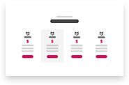
Customers need various pricing options for comparison. Although you must not overdo it and overwhelm them with your packages. For easier and more convenient pricing comparison, highlight the main packages that best correspond to the needs of your customers. For further questions, encourage them to contact you for a tailored plan through a simple CTA (call to action) such as ‘Contact Us’. The less your buyer has to think before choosing a plan the better your conversion rate will be.

Most of the time, customers already know what they need. The only thing is, they can’t easily choose the right plan that specifically caters their needs. As such, you assist them by highlighting a recommended plan. Include additional variables — annual, semi-annual, monthly or costumed pricing plans in your page. The goal here is to minimise user confusion by highlighting a plan you think will be a good fit for the majority of visitors.
Customers love incentives. It makes them feel that they are appreciated. By doing so, they are more likely to convert if they see an opportunity for them to save money. Cash is important to them and making them realise that paying up front for a longer period is good for cash flow can be achieved through your pricing plans comparison. Emphasise discounts or special offers on your pricing page.
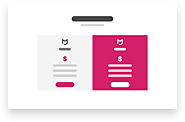
According to experts, providing customers with various currency options can help with conversion. One of the reasons why customers don’t convert is friction especially in terms of money. Let’s say you have gained the interest of European customers, it would be better if your payment options include prices in different currencies rather than having them calculate the conversion of dollars to euros.
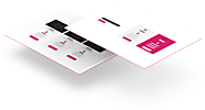
Your pricing page is a critical element of your website, so it’s a great place to let your flag fly high. Observe the same colour schemes on your pricing page as the rest of your site and brand. Let your creativeness stand out through the utilisation of creative tier names that is perfect for your packages. Customers patronise uniqueness.

In your pursuit to fully optimise your site, don’t hesitate to be creative, playful and do more testing. Keep in mind that one of the best ways to increase engagement on the pricing page is to add some playfulness. If you could incorporate a drag and drop feature to your pricing plan computations, then, feel free to do so.
A CTA (call to action) is a mission critical element that you should pay close attention to. It has to stand out and clearly convey what you want your readers to do. Don’t let other elements of features overpower the call to action on your pricing page. Your CTA has to be in essence: prominent, actionable, and specific.
Lastly, allow your visitors to gain control. Certainly, your customers want to know what will happen next right after they have taken action. The big question is: What happens after I pay? So, be sure to make the next steps clear. Remember, customers are paying valuable money and they do not want any surprises at any stage.
