-
About
- About Listly
- Community & Support
- Howto
- Chrome Extension
- Bookmarklet
- WordPress Plugin
- Listly Premium
- Privacy
- Terms
- DMCA Copyright
- © 2010-2025 Boomy Labs


 SlideUpLift
Listly by SlideUpLift
Case studies are and will always be an integral part of the business world hence the need for winning case study templates. Whether it is to analyze internal problems and finding solutions, or convincing a client on your capabilities; case study presentations are always involved in the process. This List contains 10 Case Study Templates Example Templates by SlideUpLift.
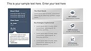
Nothing backs your arguments more than hard, quantifiable facts. In today’s terminology, we call these facts, data. Data forms the bedrock of your analysis, as everyone is convinced that ‘numbers don’t lie’. Use relevant and key data points and present them in a structured manner in your case study template, to convince the audience. Further, use understandable icons to summarize and anchor data points, such that they draw direct attention to the viewer. Icons also provide easier readability to the case study template, as one can simply look for the icon to search for the required information. - https://bit.ly/30OuWuf
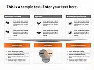
You can load your pages with a plethora of information, believing that it will convince your audience. But an overload of text and numbers just disinterests the viewer, weakening your case. Hence use engaging visuals, images, icons, graphs, charts, etc., that keep your viewer interested and conveys the information without stressing too much of their grey matter. - https://bit.ly/3daBGFk
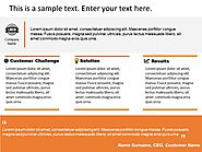
Case studies are an effective marketing tool to convince your clients. So, while making a case study template, keep your clients in your mind. Wear their shoes and ask, what is it that they are looking for, and how can you present it right in front of them! - https://bit.ly/2YHnP3V
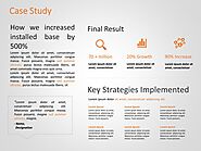
It is important to highlight the key takeaway in your study, throughout your case study template. While choosing or designing your template, you should make sure that each section has enough potential to show the key takeaway, which is your strongest argument, in prominence. Look at the example above, and see how without going in the entire report, you cannot miss the key point. - https://bit.ly/3ebzyyh
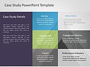
Use color schemes that suit the environment and your pitch, to showcase your professionalism. It takes one wrong color, to create the impression of a sloppy firm. A good tip will be to use the monochromatic theme, which is a classic professional color scheme. - https://bit.ly/3fA4Y1N
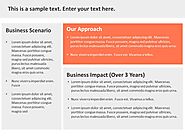
Use the principles of visual hierarchy, and create a contrast between the important information, and the background matter, to draw attention to the right material on the page. - https://bit.ly/3daBGFk
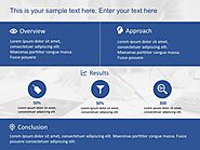
It goes without saying that you should keep your research thorough and inclusive. Research the company, the client, the problem statement, the solution, and every single data you have mentioned in your solution. Also be prepared for things that you are not writing, such as alternate solutions, market changes, legal hassles, and finer details of your proposals. Under preparedness, or false claims will definitely pull the rug from under you! - https://bit.ly/2CguTx1
