 Michiel Holsheimer
What are the best tools to create those awesome infographics
Source: http://edudemic.com/2012/08/diy-infographics/
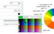
Made for Windows, Tableau Public lets you (like Infogr.am) bring your actual data into the world of visualzation. I like their maps feature but can see the value of using the tool on a regular basis thanks to the ‘live dashboard’ that lets you monitor all aspects of your design. Great for teachers without a lot of time or for a project-based learning environment that wants to track metrics. Best of all, you can make the infographics into interactive web-based visualizations with ease.
Want to spice up your next faculty or staff meeting? Gliffy (love the name, btw) lets you whip up flowcharts, floor plans, and pretty technical renderings with ease. It reminds me of Prezi but generates static images. Useful for presentations by both teachers and students.
Want to get a beautifully simply visualization of data over time? It’s easy to use Dipity to create certain types of web content in a highly visual format. Consider using Dipity as a tool to map out the history of just about anything by creating multimedia timelines.
I absolutely love Easel.ly. It was one of the first tools I found that helped me create a few infographics for the Edudemic Magazine. It’s also grown quite substantially over the past few months, yet is still in beta. Therefore, be on the lookout for some more improvements to the web-based software. For now though, easel.ly lets you easily (get it?) create various charts by just clicking and moving the mouse. No data skills required.
Venngage (likely named for Venn diagrams) is a double threat. It lets you easily create infographics and other data visualizations but, more importantly, it lets you track the analytics of who is viewing your infographic. Could be great for a classroom of students who want to see who can make the most popular infographic!
One of the most simple tools, Infogr.am lets you actually import data right into the site and then translate it all into useful visualizations. What could be better than that? I could see this being useful for making large posters showing off attendance, performance on certain metrics, and other classroom-based data streams.
This one’s an iPhone app that’s worth trying out. It simply analyzes the photos on your iPhone and then turns them into nifty infographics. Pretty simple and could be fun for trying out every once in awhile. Costs $0.99 but would be fun to use for a 1:1 or PBL classroom that takes photos on a regular basis. Good for tracking usage of the iPhone’s camera etc.
Want to show off your social media skills? Intel whipped up a nifty tool that I haven’t seen mentioned in many education blogs so I figured it’d be helpful to share. The tool is called What About Me? and it lets you create an infographic based on your social media accounts. Visual.ly also does this but this tool ties in a few more social networks. YouTube, for example. Great for a classroom of avid social media users!
Saving the best (imho) for last! A favorite of the Edudemic audience, Piktochart is a great way to visualize just about anything. You can drag and drop your way to visual success by using Piktochart’s themes and other ready-made tools. Piktochart lets anyone (even those without design skills) become a graphic designer in no time!
Visual.ly Create is the fastest, smartest and most beautiful approach to data visualization yet. Simply connect and click to produce an infographic in seconds.
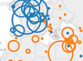
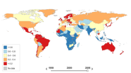
Create interactive maps using the award-winning free StatPlanet software. Explore thousands of world stats through interactive maps and data visualizations.
Inkscape is a Vector Graphics Editor, similar to Adobe Illustrator, that strives to be SVG Compliant, open source, responsive and extensible.
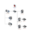
Draw, share and collaborate on online diagrams. Easy web flow chart, network diagram, mockup, wireframe, UML diagrams like Class, Sequence, & data flow and process flow diagrams. Creately - free web-based software for online diagram software
Online Charts Builder based on Google Charts API
AmCharts is a set of JavaScript (HTML5) and flash charts for your websites and Web-based products. An ideal tool to generate charts for your interactive infographics.
Visualize your resume in one click.
Many Eyes is an experiment by IBM Research and the IBM Cognos software group with a simple belief: ‘Finding the right way to view your data is as much an art as a science’. Many Eyes provides a range of visualizations from the ordinary to the experimental, where each can be put together with a click
iCharts accelerates data storytelling with simplistic, interactive, visualization tools for big and small data providers.
Beautifully crafted timelines that are easy, and intuitive to use.
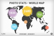
Android Photo Infographic Generator. Photo stats analyzer. Create awesome looking high-res infographics from your photos!
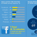
Have you ever wondered what time of day you...
What About all the Goodies? 60% of people respond better to visual data then text. As such we have specialized in developing infographics to convey data and advertisements in a more captivating and effective way. Besides we just love creating data visualizations otherwise known as infographics!
Get up to speed on your social media images sizes with this awesome infographic that shows you the different images sizes for each platform in 2018.