-
About
- About Listly
- Community & Support
- Howto
- Chrome Extension
- Bookmarklet
- WordPress Plugin
- Listly Premium
- Privacy
- Terms
- DMCA Copyright
- © 2010-2025 Boomy Labs


 Ellen van Aken
Listly by Ellen van Aken
Videos to celebrate or inform about the (re)launch of an intranet or enterprise social tool.

This is the intranet for the council of the island of Tenerife in Spain. (Nice logo, the Teide volcano). It is practical, easy and collaborative. Next to the usual topics, they have a "survival kit" with the most relevant links.
Uploaded February 2025
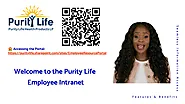
A simple but effective teaser/demo for this intranet. It looks like slides from a PowerPoint, with a lady talking in a special frame. It works, especially as the spoken word is delivered flawlessly.
This is a Canadian provider of high-quality natural health products that prioritize purity, efficacy, and sustainability. They have Supplement, Beauty, Food and Sport Nutrition categories.
You can decide whether the intranet language is French or English.
There are some screenshots of this SharePoint-based intranet, but not enough to see what it looks like in its entirety.
Uploaded June 2025.

The new intranet for this well-known travel luggage provider.
It looks somehow very professional but not very friendly, possibly because of the serif letters in the headers. I do not know, it looks a bit serious.
The new intranet is supposed to be more intuitive, more efficient and has everything you need for your daily work, obviously.
It has a lot of corporate info, like history and mission and values, but also news, events, employee information etc. And "it adapts to you", especially to your device.
This is a video from Chile, I think. I am not sure if this video is for the whole Spanish-speaking part of the organization, or a translation of the global video.
Uploaded May 2025.
They also have a teaser:

A refreshing format, where the CMO and the COO (their names and roles are shown in the beginning - good 👌) of this American real estate brokers organization discuss and show the new intranet. It is a very lively way to demo. They take their time going through all the sections (or "rooms" as they call them) and discuss what it is and how you can use it. It is quite long but not boring as the two chat along happily about their business. There's news and events, of course, but also a lot of real estate information.
They also have an app that you can download from the app stores. It is called Konverse.
The intranet has been launched by half May, 2025.
Uploaded May 2025.

Get ready to embark on a journey through the digital wonderland that will transform the way we work, collaborate and stay connected.
A rather pompous stiff-upper-lip-British-speaking tour guide, Colin, takes you on a "bus tour" across this intranet for Hornsby Shire Council, a town in New South Wales, Australia. It is an interesting setup, with stops for each major "building block". After 5 minutes it gets a little predictable, but it is all very well executed with explanations, examples and a few jokes. Anyway, both the Home Page and the various menu items are what you expect from a serious intranet. They also use a megamenu.
It has been introduced on May 14, 2025, and it is on SharePoint. And it is called "Connect"!
Uploaded May 2025.

At first, I wondered about the language in this video. It looks French, but the spoked texts sounds different than the European French I am used to. Then I found out this is Canadian French, that is new to me!
This SharePoint intranet has been launched on April 15, 2025. It is the intranet for a Canadian conglomeration of companies under multiple brands active in convenience store operations, retail fuel sales, restaurant and food services, home comfort, and transportation logistics. We see a few parts of the intranet: Home, Marketing, HR and gas station stores (I think). It looks clean SharePoint.
Uploaded March 2025.

Short video introducing CSC's new intranet portal. Cheerful people video from this Chief People Officer about the transition of their Newsletter to a fully-fledged intranet. And guess what, it will be called CSC Connect! This USA organization is in the laundry business.
It is on SharePoint, you can see from the (mobile) preview, and will focus on two major company initiatives, one of them being a move to a consolidated platform. I guess Microsoft365.
Uploaded March 2025.
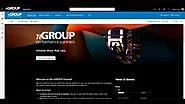
This intranet for an American logistics services provider is meant to keep you informed, connected and productive.
It has all the content you can expect, such as News and information per division/department. Every department also has their own private section.
Uploaded January 2025.
(Just click on "Learn More" when you get the message that this video does not like to be played here)
A pretty old one but still a nice video, although the interface is a tad outdated. It focuses mainly on News.
Intranet for all devices, you can personalize the widgets and move the content around. You do not see that often anymore, as we have learned that only a very small percentage of users actually personalize their intranet. This is the intranet for a Swiss bank.
The video ends with a request to start updating your profile. Nice.
Uploaded June 2015.

(Just click on "Learn More" when you get the message that this video does not like to be played here)
Very fast and extensive demo for an intranet for a Brazilian supplier of electrical equipment. It has subtitles in Portuguese, but due to the speed it is hard to follow. In any case, a thorough demo for all items in the navigation. It has a lot of functionality, like News, HR information, weather, stock exchange info, map, lists of all branches, documentation, social features and what not.
Uploaded March 2025.
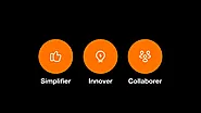
Compact very structured teaser for this city in France with some interesting keywords: Simplify, Innovate , Collaborate and Connect.
With this intranet youcan:
The intranet looks very clean and nice, although personally I would like to have some stronger colours.
Uploaded December 2024

Very decent teaser for the intranet of a company that deals in electrical optical components. Again, this intranet has been created to communicate, collaborate and connect.
There's an onboarding section, teaching you a.o. to connect to SharePoint and OneDrive (although this intranet is Simppler, not SharePoint).
Nice employee directory, and the search results are interesting: first you get an AI generated text on top, and any links to documents or other pages underneath.
Uploaded November 2024

Quite short demo of the e-health part of intranet for a USA Heath Care organization. They also have some traditional hospitals. This part of the intranet has all relevant information for conducting an on-line health appointment.
The intranet is based on Google Sites which makes an interesting change from SharePoint 😁
Uploaded November 2024

This is a demo for an intranet based on SharePoint and Teams, for an Irish-based not-for-profit organisation providing health and social care, training and education, rehabilitation, employment and commercial services for people with limitations and disabilities.
Nice intranet, colour scheme fits with the website, and a nice voice explaining all items. It has all the usual stuff. It is still in development, apparently.
I like the voice-over; it is soft but clear and has a hint of an Irish accent.
Uploaded May 2024
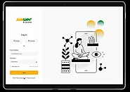
Isn't it cool to see the intranet of a big brand? Well, here's Subways! Nice (silent) walkthrough of the content. There's messaging between team members and manager, there's company news, there are some tidbits about wellbeing and time management, training courses for serving perfect coffee, and schedules. All in all quite nice, with big colour blocks. I do find the letters a tad on the small side, and I wonder if the contrast of letters and background is large enough. Intranet for young people with excellent eyesight, I guess 😁.
Uploaded June 2024.
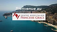
My first entry from Monaco!
First you think that this video highlights the benefits of this hospital, but it turns into an intranet teaser/demo after about 25 seconds. Phew!
The new intranet saves time, can be accessed from anywhere and from every device, is personalized, and contains lots of useful forms, such as entering your children at the creche (daycare). It also has small ads to sell your stuff, and quizzes. It does not show too much of real hospital care, such as work instructions, but that may be the selection of topics.
Uploaded September 2024.

7 seconds of the "signature" of the intranet of a Canadian news broadcaster. Short but sweet.
Uploaded September 2015.

The organization that this teaser video has been made for, is either the Swiss department of foreign affairs, or a producer of large engines for forestry. 😁 Apologies for not knowing!
A lovely teaser, where people from all over the world, in this organizations offices, say something about their country and welcome you to their new intranet, in their own language.
Uploaded August 2015.

This is the intranet for a USA-based financial services provider. It may be from 2015, but it is a good demo. The intranet looks current. The intranet is available on all devices, can be personalized, and has all the usual trimmings such as news and tools to do your work. It is a tad on the corporate side (mission, vision, culture topics).
Uploaded June 2015.

The new intranet for the Royal Dutch Academy of Arts and Sciences. Sadly it does not show any real intranet details, just animations. But you can customize it yourself and it contains everything to do your work, find others, find information etc. All information is available in Dutch and English, so it makes sense that there is also a Dutch version of this video:
There is also a video about logging in. I am sharing the English version only:
Uploaded May 2024

Short upbeat teaser/demo for the intranet of this global logistics organization. It is a vertical video with a noisy soundtrack and someone talking over it.
Anyway, there are all kinds of useful info here, such as manuals and processes, options to find and connect with your colleagues, etc. It is on SharePoint (guess how I know that?) and looks very much like their website.
Uploaded September 2024

Turn down the volume, as the music is quite loud.
Short, to-the-point teaser (LOTS of info in 45 seconds!) for the first ever intranet for this commercial money exchange organization based in the UK, but operating globally.
It contains a lot of good bullet points, that anyone working on intranets may find helpful.
Purposes are: Streamlining communication, improving data security, enhancing productivity. And key features that you can expect, such as News, a Knowledge Base, Document Management etc.
Sadly, there is no glimpse of the intranet provided but the name has Connect in it and you know I like that! 😁
Uploaded July 2024

Nice people video from the CEO of an association of dentists in the USA. As this is a dispersed organization, it is essential to communicate in many ways, so the intranet will be one way, but there will still be emails, whatsapp/text messages etc, whatever works. In a way that is good, but it is not exactly "Ruthless Implementation" of an internal communications strategy. 😁
The good things about this video are: name and role of the speaker is shown, the message is clear, the background is sufficiently neutral (but what do construction helmets do at this scene?) and it is short (1 min) so you do not get bored. I do not particularly like the background music - it makes the sound rather cluttered.
Uploaded August 2024

This is a people video and a preview in one. First a few employees (with name and role, well done) inform the audience about the importance of a new intranet, and how it was created without departmental silo's, but with the employee and their needs as the central principle. We also see some screenshots from the sessions that were done to get to this intranet.
Then (at about 1.30 mins. into the video) there is a preliminary version of what it will be. There are still a lot of "Lorum Ipsums" but the idea is clear. You can personalize the homepage and there are 5 main navigation items: News, Sales stuff, Selfservice, your personal page and "Useful info".
I particularly like the Personal page (about 2.50 mins into the video), where you can see your wages, the progress of your objectives in a graph, your upcoming training sessions etc.
This is the intranet for a Spanish bank. The intranet looks very much like their website, with tons of whitespace and a custom (or in any case not very common?) typeface.
Uploaded September 2024.

Decent demo of an intranet for the fire-and-rescue-brigade for the island of Mayotte, an overseas part of France. This is an official French department.
The demo focuses on 5 items: Easy access to information, Contact colleagues, Take part in events, Find easily and Collaborate. The intranet looks very nice and clean and the demo is short but provides the essentials.
Uploaded October 2024.

SharePoint (Online) | Office 365 | Intranet | Digital Workplace | Knowledge Marketing | Social Media