Peter Davison
Different fonts spark the creative process. Vote up your fonts and we'll share the results. Remembary - The Connected Diary was created by Andrew Burke. This is part of the #remembarychat
Source: http://remembary.com/blog/2012/9/7/join-us-for-remembarychat
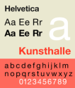
Helvetica is a widely used sans-serif typeface developed in 1957 by Swiss typeface designer Max Miedinger with Eduard Hoffmann.[1]
London Olympics 2012 Font - Thanks to Chris MacNeil for bringing this one to our attention. :)
Always a classic
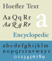
Hoefler Text is a contemporary serif Antiqua font that was designed for Apple Computer to demonstrate advanced type technologies. Hoefler Text was created to allow the composition of complex typography; as such it takes cues from a range of classic fonts, such as Garamond and Janson.
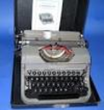
American Typewriter is a style of typeface created in 1974 by Joel Kaden and Tony Stan for International Typeface Corporation based on the form and monospaced feature of the early Sholes's patent of the typewriter. They adapted the friendliness and immediacy of this style into the proportionally spaced font. This face was never made as foundry type, but appeared first as cold type and has subsequently been made into digital type.
Segoe ( /ˈsiːɡoʊ/ SEE-goh) is a Humanist typeface family that is best known for its usage by Microsoft. The company uses Segoe in their online and printed marketing materials, including recent logos for a number of products. Additionally, the Segoe UI family of fonts is utilized by numerous Microsoft applications, and may be installed by applications (such as Microsoft Office 2007 and Windows Live Messenger 2009) or bundled with certain operating systems (including Windows Vista and Windows 7). The font is also used for outlook.com, Microsoft's latest email service which will replace Hotmail. As of August 2012[update], Microsoft uses Segoe as part of their corporate logo.[1] == Thanks Jialing Ge for this one.
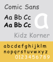
Comic Sans MS (or Comic Sans) is a sans-serif casual script typeface. The modern Comic Sans was designed by Vincent Connare and released in 1994 by Microsoft Corporation. It is classified as a casual, non-connecting script, and was designed to imitate the historical look of comic book lettering, for use in informal documents.
One of my favourites is 'Anatevka Caps', cant really explain why I just love the way it looks when used. It has a natural feel to it as well.
Background information about the font designer Richard Bradley. Linotype.com: All the fonts you need. From classic to cool.
Archive of freely downloadable fonts. Browse by alphabetical listing, by style, by author or by popularity.
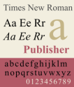
Times New Roman is a serif typeface commissioned by the British newspaper The Times in 1931, created by Victor Lardent at the English branch of Monotype.[1] It was commissioned after Stanley Morison had written an article criticizing The Times for being badly printed and typographically antiquated.[2] The font was supervised by Morison and drawn by Victor Lardent, an artist from the advertising department of The Times. Morison used an older font named Plantin as the basis for his design, but made revisions for legibility and economy of space. Morison's revision became known as Times New Roman and made its debut in the 3 October 1932 issue of The Times newspaper.[3] After one year, the design was released for commercial sale. The Times stayed with Times New Roman for 40 years, but new production techniques and the format change from broadsheet to tabloid in 2004 have caused the newspaper to switch font five times since 1972. However, all the new fonts have been variants of the original New Roman font.
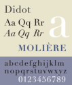
Didot is a name given to a group of typefaces named after the famous French printing and type producing family. The classification is known as modern, or Didone. The typeface we know today was based on a collection of related types developed in the period 1784–1811. Firmin Didot (1764–1836) cut the letters, and cast them as type in Paris. His brother, Pierre Didot (1760–1853) used the types in printing. His edition of La Henriade by Voltaire in 1818 is considered his masterwork. The typeface takes inspiration from John Baskerville's experimentation with increasing stroke contrast and a more condensed armature. The Didot family's development of a high contrast typeface with an increased stress is contemporary to similar faces developed by Giambattista Bodoni in Italy. Didot is described as neoclassical, and is evocative of the Age of Enlightenment.
In the desktop publishing world, most of us have heard of the Berkeley font but do you know the Berkeley typeface history? Learn here who first created the Berekely typeface, when it was redesigned and where you can find this typeface from various sources online or access it in Adobe Photoshop.
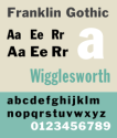
Franklin Gothic and its related faces are realist sans-serif typefaces originated by Morris Fuller Benton (1872–1948) in 1902. “Gothic” is an increasingly archaic term meaning sans-serif. Franklin Gothic has been used in many advertisements and headlines in newspapers. The typeface continues to maintain a high profile, appearing in a variety of media from books to billboards. Despite a period of eclipse in the 1930s, after the introduction of European faces like Kabel and Futura, they were re-discovered by American designers in the 1940s and have remained popular ever since.
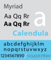
Myriad is a humanist sans-serif typeface designed by Robert Slimbach and Carol Twombly for Adobe Systems. The typeface is best known for its usage by Apple Inc., replacing Apple Garamond as Apple's corporate font since 2002. Myriad is easily distinguished from other sans-serif fonts due to its special "y" descender (tail) and slanting "e" cut. Myriad is similar to Frutiger.
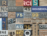
Long before the emergence of a profession called "graphic design," there was signage. Up until the mid-twentieth century, the job of providing architectural lettering often fell to engineers or draftsmen, most of whom worked outside of the typographic tradition. The shape of facade lettering was often determined by the practical business of legibility, rather than any sort of stylistic agenda — although inevitably, even the draftsman's vision of "basic building lettering" was influenced by the prevailing style of the time.
From out of the six typefaces originally created for the Guggenheim Museum comes Verlag, a family of 30 sans serifs that brings a welcome eloquence to the can-do sensibility of pre-war Modernism.
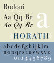
Bodoni is a series of serif typefaces first designed by Giambattista Bodoni (1740–1813) in 1798. The typeface is classified as Didone modern. Bodoni followed the ideas of John Baskerville, as found in the printing type Baskerville, that of increased stroke contrast and a more vertical, slightly condensed, upper case, but taking them to a more extreme conclusion. Bodoni had a long career and his designs evolved and differed, ending with a typeface of narrower underlying structure with flat, unbracketed serifs, extreme contrast between thick and thin strokes, and an overall geometric construction. Though these later designs are rightfully called "modern", the earlier designs are "transitional". Some digital versions of Bodoni are said to suffer from a particular kind of legibility degradation known as "dazzle" caused by the alternating thick and thin strokes, particularly from the thin strokes being very thin at small point sizes. This only occurs when display versions are used at text sizes, and it is also true of much display type that is used at text sizes. Non-dazzling versions of Bodoni that are intended to be used at text size are "Bodoni Old Face", optimized for 9 points, and ITC Bodoni 12 (for 12 points) and ITC Bodoni 7 (for 7 points).
Trade Gothic LT Std Bold No. 2
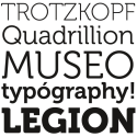
Love Museo. We use it at Listly for all the titles.
I've linked to an interview with the author of Museo, Jos Buivenga.