-
About
- About Listly
- Community & Support
- Howto
- Chrome Extension
- Bookmarklet
- WordPress Plugin
- Listly Premium
- Privacy
- Terms
- DMCA Copyright
- © 2010-2025 Boomy Labs


 Donald McLeman
Listly by Donald McLeman
These are 100% free stock images shared across the internet. I made subtle changes in Photoshop to enhance them – cropping, tweaking contrast and adding colour filters, nothing too fancy. Sometimes a few tricks that must remain secret… except where I reveal all in the description.
If you click through you'll see the finished image with added text. Most of the time you'll be able to spot the difference, but sometimes all the image needed was a tweak and you'll wonder why did I bother?
Many thanks to the photographers behind the lens and the photo libraries that share these resources. It takes more than one eye to make a good picture – so thank you all.
Vote up whichever you think best :)

The result is one of my favourite images. The background of the original was a functional white. I changed the background colour to make a great combination with the orange, and it's one of the shades of green on NatureHoldsTheKey.com .
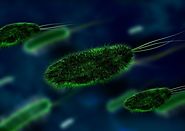
The original image is dark and menacing but I wanted something brighter. The changes in PhotoShop were actually fairly simple, though quite bold: I added a gradient map and changed the hue to give it a surreal feel. The result looks fluorescent and unnatural, just right for toxins, minus the evil undertones.
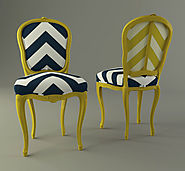
The free image lacked the impact I wanted. The original image was more detailed and realistic, as in a product catalogue. I added a colour map to add an unnatural feel to the colours and boost the contrast. I have to say what I like best about this one is the colour choice for the text I used on social media versions.
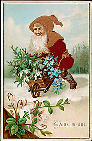
The original image was beautiful but it was a problem. It was small in terms of byte size and small in dimensions. It just wasn't wide enough to be a feature image. I stretched the perspective just beyond the limits of realism – the figure is still recognisable and my tweaking looks intentional, I think? I certainly couldn't stretch any more so in some social media versions I filled the frame by adding vertical bars composed off enlarged segments of the original. In the main version on the website I opted to refrain from stretching and just used the dark teal background found on NatureHoldsTheKey.com .
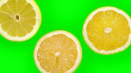
I cropped the original drastically to focus on only one part of a slice; the original featured three slices on a green background. I wanted a sharp zesty colour for the background, something that works well with the zesty yellow.
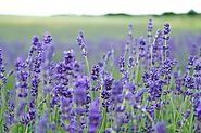
My biggest problem with the original image was the burnt-out white sky. I brightened up the greenery in the foreground but overall it seemed to fit just right :)
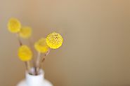
I loved the original image. No big changes were needed, all it took was a little extra contrast. The crops for social media were radically different; I cropped in close-ish to the in-focus central globe and cloned out the distracting vase.
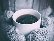
I liked the original image but I wanted to increase the feeling of warm-cold. I added colour filters to accentuate the depth of the blue while maintaining the warmth of the coffee.
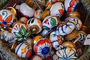
The original free image was just too 'realistic'. If you look closely at the retouched image you'll see that I've overlayed the image with a circular 'bubble-wrap' pattern that reduces the opacity. I also reduced the saturation and added a warming filter.
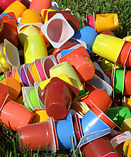
This took a bit of effort and thought. The subject of the image is ugly plastic waste and it was too realistic to look good. As the subject of the article is waste so I thought an unnatural feel would be appropriate (which is a rare thing on a blog that praisees nature). However most of the effects within PhotoShop can result in ugly garish colours. I used a combination of gradient maps and reduced the saturation to achieve a more retro feel.
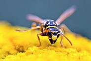
I liked the original but it wasn't quite right when I posted it on the website. The blue background clashed with the colours of my website – it was just too 'almost-similar' to an existing blue used in the web design. I went back to PhotoShop to change the background colour of the original to the exact shade of blue used on the site. In line with this change I also reduced the saturation of the yellow foreground.
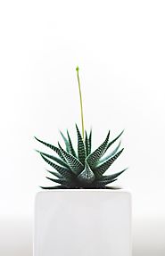
This was an unusual image for me. The background was plain white, though when I superimposed it on other backgrounds I found that it was actually off-white; so in social media versions I added a drop-shadow border. The original image had a central stalk which I cloned out as it detracted from the impact of the shape.
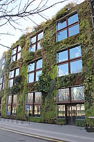
This took a lot of work. The original stock image was much larger and the building was at a more acute angle. I changed the perspective, added a heavy warm filter and cloned out lots of extraneous details.
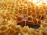
The original image featured a much larger chunk of beeswax with a metal wire in the middle which had to be cloned out. I cropped in as close as I could to focus only on the honeycomb shapes to avoid the burntout area but without losing any more sharpness. Most of the enhancement came in the form of 'traditional' retouching techniques such as burning and shading.
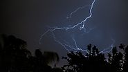
This image didn't take a lot of work, the photographer did it all! I changed the colour and tweaked the contrast.
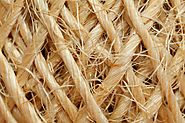
I wanted an image that said 'fibres' without singling out one particular type. As this was such a close-up the important part was to enhance the sharpness – this took a variety of sharpening tweaks to make it perfect but it worked out great for most situations,.
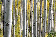
I came back to re-do this image. The first version was just the woodland that you see above, it didn't include the overlaid mousepads.. I felt it wasn't clear enough that the article was about mousepads so I overlaid a selection of the actual mousepads from the article and placed an opaque layer above the woodland photograph to reduce its opacity.
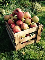
The original image was realistic and 'ordinary' dented only by an orange filter. I thought a retro feel would be more appropriate. I stripped the colours back to two then dodged and burned to make it feel more olde-worlde.
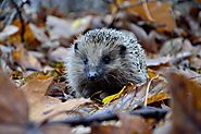
I wanted something that people could identify with for this article and you can't beat a friendly face on an animal :) It was only after I positioned this image that I noticed thar the hedgehog looked like it was racing so I incorporated that into the text. Most of the work here went into changing the colours to make the leaves warmer (and less soggy) and the hedgehog more 'touchy-feely'.
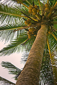
This was a difficult image. The original image was very plain and realistic with a pink caste. I began first by modifying the colour, changing the colour map to remove the existing tone of the sky. Originally everything was in focus so I added very heavy blurring to focus only on the coconuts to highlight that these were the raw material that the doormats were made of.

This took a lot of work, with several components combined to get across a simple instruction. And of course I also wanted it to look good. I played around a lot with re-sizing the various components to arrive at something colourful and easy to understand.

The original image was less dreamy. I added a lot of warmth to the colours and cropped in close. I super-imposed the logo of the app onto the dreamy background and decided it looked best to leave the phone at an angle (rather than twist the image slightly to line up with the right angles of the logo – that would have made it look fake whereas I wasn't aiming for any pretence that this is what the logo would look like on the screen).
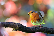
The original image here was a problem Very small size and not very sharp. It was also so saturated it detracted from the subject. I had wanted to crop in more closely for social media but that wasn't possible. I added a little more blur to the background and a little more sharpening to the bird.
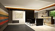
This image just took some traditional burning and dodging. I cropped in slightly to avoid the attention given to the coloured wall whereas I wanted to highlight the lights.
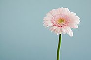
The original image required only minimal changes. I cloned out the drooping petal. I used several filters to slightly warm the background grey without losing too much of the green colour in the stem.
