 Ryan Hines
A collection of infographics by asset managers, consultants and others.
Blue is Positive forecast for 2014 compared to the same figures in 2013.Tan is Neutral forecast for 2014 compared to the same figures in 2013.Orange is Negative forecast for 2014 compared to the same figures in 2013.
A product story framed as investor need/solution.
An overview of the ILS market.
An overview of leveraged (high yield) loans as an asset class.
Underrated and overrated economic indicators from BlackRock's Russ Koesterich.
Neat visual technique--red marks as if someone made notes on the original.
Hiking-themed retirement investment prep tips.
A fund-specific retail infographic.
Infographic: Are you overlooking markets?
Survey results.
Not infographics, but a page of visuals.
The Retirement Income Strategies and Expectations (RISE) Survey revealed various views on retirement. These images can be shared in many ways, including on the web, a blog, social media or via email.
While not specifically commissioned by GSAM, but by its parent GS, this animated infographic clearly shows us the next frontier.
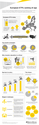
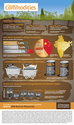
Commodities are used by everyone, everyday, in increasing quantities - but new supply is hard to come by. In our new infographic, we highlight the unique supply and demand dynamics creating exciting opportunities for the JPM Natural Resources Fund. Click the image to view in fullscreen.
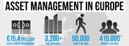
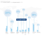
Continuing our theme of asset management infographics, here's one we created on Asset Management in Europe, based on data from the European Fund and Asset Management Association ( EFAMA). Key asset management stats in Europe Behind the U.S., Europe ranks as the second largest market in the global asset management industry, managing 31% of global AUM.
Timeline with a distinct path for the reader to follow.
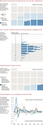
Several charts stacked vertically. Kind of an infographic.
The Millennial generation is the biggest in US history-even bigger than the Baby Boom. Millennials have grown up with the internet and smartphones in an always-on digital world. Millennials Gen X Boomers "Which online activities do you regularly do for fun and entertainment?"
Survey results.
Schroders Global Investment Trends Report 2014
Survey results and a path for the reader. Images become more complex towards the end.
Onshore and offshore perspectives on Chinese financial liberalisation. The Economist Intelligence Unit.
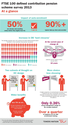
FTSE 100 defined contribution pension scheme survey 2013 At a glance This is the ninth edition of Towers Watson’s FTSE 100 DC survey and is based on data from over 90% of the FTSE 100 employers.
Research results that pay homage to the original isotype style.


![BlackRock: Guide To The Most Overrated And Underrated US Economic Indicators [Infographic]](http://media.list.ly/production/62693/554463/blackrocks-guide-to-the-most-overrated-and-underrated-us-economic-indicators-infographic_185px.png)