 Reuben Walker
Thanks to the advances in server sourced fonts great Typography is coming into the web design process in a big way. One of the most important pillars of quality design is getting its day in the online sun. Good typography makes your most important content, your copy, readable. It makes your site look professional and trustworthy. Without it you will accomplish nothing.
Good typography can be a cornerstone to a successful web design. Because so much of web design comprises of text, hitting the right mark for your typography is a key factor in the overall success of your site. The subtleties of fine typography can be a difficult thing for beginners to grasp...
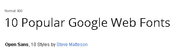
There's no shortage of "trends' that Web designers must pay attention to, but few are more practical - and impactful - than the use of Web fonts. Many, many Internet years ago, Web designers choice of fonts were limited to the typefaces that were found on users' machines.
For years you have been searching for it. You hear the question being asked in your dreams as you go on an Indiana-Jones-type-crusade to find the answer. When the answer comes to you, you know that the confetti will fall from the ceiling and the band will start playing your favorite song.
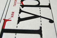
This entry is part 1 of 9 in the A-Z of Web Typography Session Next " those which influence your choice of typeface and those which you can manipulate (often through CSS). Every conceivable feature of typography can be referred to by its name.
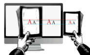
by Oliver Reichenstein When we built websites we usually started by defining the body text. The body text definition dictates how wide your main column is, the rest used to follow almost by itself. Used to. Until recently, screen resolution was more or less homogenous.
Today's post was authored by designer Aura Seltzer. Maybe you've been there before: You open a zip file of logos, flip through samples from a recent ad campaign, or someone hands you a binder of brand guidelines. You gulp, and prepare to design a website whose aesthetic will hold together these disparate pieces.
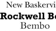
Mixing typefaces can be on of the most rewarding, and trickiest parts of the design process. Creating the perfect pairing of typography can result in a beautiful and perfectly readable outline for almost any project. But how can you get started? What should you consider when mixing typefaces?
Psychologists have proven that typography has a significant measurable effect on the influence and interpretation of your written copy. With this in mind, typography could be the most important part of any design, and it should be chosen purposefully and pragmatically - not based on the whims or personal preferences of any designer.
We reveal 20 font duos that are made for each other. Ideal for your design projects, some may surprise you! It's a classic conundrum for any graphic designer: picking two (or more) typefaces that set each other off, don't fight the eye for attention, and harmonise without becoming homogenous and dull.

Reuben Walker is Mobile Atom Media. He provides expertise and resources for using websites, blogs, social media, mobile media, apps and email to increase sales for your organization. He is your con...